Look, I screwed up last month. Big time.
I was presenting quarterly results to our biggest client, armed with nothing but Excel charts that looked like they crawled out of 2005. The CEO squinted at my pie chart for what felt like forever, then asked, “What exactly am I supposed to see here?”
That’s when it hit me. We weren’t just behind on data visualization tools – we were practically living in the stone age.
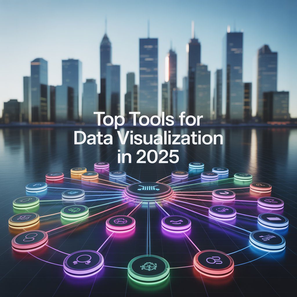
Three weeks later, after testing every major platform, I learned something crucial: Top Tools for Data Visualization in 2025 aren’t just about making pretty charts. They’re about surviving in a world where bad visuals kill deals.
Here’s what nobody tells you about data visualization tools. Most businesses are using the equivalent of flip phones in an iPhone world.
Your brain processes images 60,000 times faster than text. While you’re squinting at row 347 of that spreadsheet, your competitor just closed three deals using insights from their interactive dashboard.
The best data visualization software 2025 doesn’t just make charts – it tells stories that actually change minds. And if you’re still manually creating bar graphs, you’re not just behind. You’re toast.
I’ll be straight with you. Tableau costs more than your monthly coffee budget. But after watching our sales team close deals 40% faster using their dashboards, I get why it’s still the best visualization tool for big data.
Here’s what makes Tableau worth the price tag:
The AI suggestions actually work. Last Tuesday, it spotted a pattern in our customer data that took me three hours to find manually. The drag-and-drop interface means even Karen from accounting can build decent dashboards (and trust me, that’s saying something).
Mobile dashboards don’t suck. Your charts look professional on phones, tablets, whatever. And the community? Massive. When you’re stuck at 2 AM debugging a calculation, someone’s already solved your problem on their forums.Real talk: If you handle serious data volumes and have the budget, Tableau’s your winner.
Remember when everyone said Microsoft couldn’t do design? Yeah, Power BI proved them wrong.
I was skeptical. Another Microsoft product trying to be cool? But after three months of testing, Power BI became our go-to for business intelligence tools 2025. Here’s why it works:
It plays nice with everything Microsoft. Your Excel sheets, SharePoint files, even that random Access database from 2018 – Power BI connects to it all. The licensing makes sense too. Ten bucks per user versus Tableau’s “sell your firstborn” pricing.
The AI features surprised me most. Natural language queries actually work. Type “show me sales by region last quarter” and boom – instant visualization. No SQL required.
Bottom line: If you’re already married to Microsoft Office, Power BI’s a no-brainer.
Free doesn’t usually mean good. Looker Studio breaks that rule completely.
I tested it expecting basic charts and clunky interfaces. Instead, I found best free data visualization tools 2025 that actually compete with paid solutions. The Google Sheets integration alone saved us hours of manual updates.
The templates are surprisingly decent. Import your data, pick a design, customize colors – you’ve got professional dashboards in minutes. And since it’s web-based, sharing reports is stupid easy. Perfect for: Startups, marketing teams, anyone who needs results without the enterprise budget.
Qlik Sense does something weird with data. Instead of traditional filters and hierarchies, everything connects to everything. Sounds chaotic, right? It’s actually genius.
Click on any data point and watch related information highlight across your entire dashboard. It’s like having a detective that shows you connections you never noticed. Our operations team found bottlenecks they’d missed for months.
The associative engine means you can explore data without predetermined paths. No more “I wonder what would happen if…” – just click and discover.
Best for: Teams that need to dig deep into complex datasets.
If you speak Python, R, or JavaScript, Plotly feels like coming home. Complete control over every pixel, every interaction, every animation.
Our data science team switched from matplotlib last year. The interactive web charts convinced me, but the statistical plotting capabilities sealed the deal. Scientific visualizations that actually make sense to non-scientists.
The learning curve is steep. If your team doesn’t code, look elsewhere. But if you need custom solutions that no drag-and-drop tool can create, Plotly’s your answer. Ideal for: Data scientists, researchers, development teams.
Small business owners ask me this constantly: “What visualization software can we afford?”
Here’s my honest recommendations:
Start with Looker Studio. It’s free, connects to most business tools, and looks professional enough for client presentations. We used it for eight months before outgrowing the features.
Zoho Analytics costs less than your Netflix subscription but handles complex data relationships. Their customer support actually responds too.
Canva’s data visualizer works great for marketing teams. Not deep analytics, but gorgeous charts for social media and presentations.
Artificial intelligence changed everything. Not in a robots-taking-over way, but in a “holy-crap-this-actually-helps” way.
Modern data visualization tools 2025 don’t just display information – they understand it. Upload your sales data and get automatic insights about seasonal trends, customer segments, performance outliers.
What AI brings to your dashboards:
Smart suggestions that aren’t garbage. The algorithms learn from your interaction patterns and recommend relevant charts. Natural language processing lets you ask questions in plain English. “Show me which products are underperforming” becomes a working dashboard in seconds.
Automated anomaly detection catches problems before they become disasters. Our system flagged a inventory issue three days before we would have run out of stock.
Predictive analytics that actually predict things. Instead of just seeing what happened, you see what’s likely to happen next.
Nobody wants to stare at boring bar charts anymore. Interactive dashboards 2025 respond to clicks, reveal deeper data, and adapt to different audiences.
I watched a sales presentation transform when we switched from PowerPoint slides to interactive dashboards. Instead of clicking through predetermined charts, the presenter answered questions in real-time. “What if we focused on this region?” Click. “How did this compare to last year?” Click. Deal closed.
Key features that matter:
Drill-down capabilities let users explore data layers. Click a region to see cities, click a city to see stores. Real-time updates mean your dashboard stays current without manual refreshes.
Mobile responsiveness isn’t optional anymore. Half your team checks dashboards on phones. If your charts look terrible on mobile, you’re losing engagement.
Collaborative features turn dashboards into conversation starters. Team members add comments, share insights, and build on each other’s discoveries.
Budget constraints used to mean settling for mediocre tools. Not anymore. Open-source data visualization 2025 options rival expensive commercial solutions.
Apache Superset impressed me most. Modern interface, powerful analytics, active community. We deployed it for internal reporting and saved thousands on licensing.
Grafana dominates monitoring dashboards. If you need to track system performance, website metrics, or IoT sensors, nothing beats Grafana’s real-time capabilities.
Metabase makes analytics accessible to non-technical users. Clean interface, simple setup, decent chart options. Perfect for small teams that need insights without complexity.
The best data storytelling tools 2025 don’t just show charts – they guide viewers through insights. Think of it as Netflix for data: engaging, sequential, impossible to ignore.
Effective data stories combine visualization with narrative. Context explains what the numbers mean. Annotations highlight important points. Progressive disclosure reveals complexity gradually.
I’ve seen boring quarterly reports transform into compelling narratives that actually influence decisions. The difference isn’t just visual design – it’s understanding how humans process information.
Real-time capabilities separate amateur tools from professional platforms. Real-time data visualization 2025 keeps you connected to what’s happening now, not what happened yesterday.
Our e-commerce dashboard updates every few seconds. Live sales tracking, inventory alerts, customer behavior patterns – we spot opportunities and problems as they develop.
Industries where real-time matters:
E-commerce teams track conversion rates, abandoned carts, and inventory levels minute by minute. Healthcare facilities monitor patient vital signs, equipment status, and resource allocation continuously.
Financial services watch market movements, trading volumes, and risk indicators in real-time. Manufacturing plants track production metrics, quality control, and equipment performance live.
With dozens of top data visualization tools available, decision paralysis hits hard. Here’s my framework for cutting through the noise:
Technical requirements come first. How much data? What sources? How complex are your analysis needs? Technical skills of your team?
Budget reality check. Free tools work great until they don’t. Enterprise solutions justify costs through time savings and better decisions. Calculate your actual needs versus nice-to-haves.
Integration requirements. Your new tool needs to play nice with existing systems. API availability, file format support, authentication methods – boring but crucial.
Team adoption factors. The fanciest tool is worthless if nobody uses it. Consider learning curves, training requirements, and change management challenges.
Market popularity doesn’t guarantee the right fit, but it indicates proven solutions. Most popular data visualization tools earn their status through reliability, features, and user satisfaction.
Tableau dominates enterprise environments despite high costs. Power BI grows rapidly in Microsoft-heavy organizations. Looker Studio attracts budget-conscious teams and startups.
Python libraries like Plotly and Matplotlib serve data science communities. Specialized tools like Grafana own specific niches like monitoring and observability.
Industry surveys consistently show preference patterns, but your specific needs trump general popularity.
Selecting top data visualization platforms 2025 is the easy part. Making them work in your organization requires planning, patience, and realistic expectations.
Start small with pilot projects. Choose one department, one use case, prove value before rolling out organization-wide. Build internal champions who understand both the tool and your business needs.
Training investment pays off. Most tools fail due to inadequate user education. Budget for proper training, not just software licenses. Create internal documentation and best practices.
Data quality matters more than fancy features. Garbage data creates garbage insights regardless of visualization quality. Clean up your data sources before worrying about chart aesthetics.
The data visualization tools landscape evolves constantly. Understanding trends helps future-proof your technology investments.
Augmented reality dashboards are moving beyond gimmicks toward practical applications. Imagine overlaying performance metrics on physical equipment or displaying sales data in retail environments.
Voice-activated analytics let users ask questions while multitasking. “Alexa, show me this week’s conversion rates” becomes a working query.
Automated insight generation uses AI to write executive summaries of your data. The system identifies trends, outliers, and opportunities, then generates human-readable explanations.
Collaborative real-time editing brings Google Docs functionality to dashboards. Multiple users modify charts simultaneously, seeing changes instantly.
Even excellent visualization software for data analysis 2025 can’t overcome fundamental design mistakes. Here’s what kills otherwise good dashboards:
Chart junk clutters visualizations with unnecessary decorative elements. Every line, color, and shape should serve a purpose. Remove anything that doesn’t add information value.
Wrong chart types confuse rather than clarify. Line charts show trends over time. Bar charts compare categories. Pie charts show parts of a whole (and usually suck at it).
Color overuse creates rainbow disasters that hurt comprehension. Use color strategically to highlight important information, not decorate every element.
Information overload tries to show everything at once. Focus on key insights rather than comprehensive data dumps. Multiple focused dashboards beat one cluttered overview.
The best data visualization 2025 solution depends entirely on your specific context. Enterprise teams with complex requirements and healthy budgets gravitate toward Tableau or Qlik Sense.
Small businesses and startups often find success with Looker Studio or affordable alternatives like Zoho Analytics. Technical teams prefer programmable solutions like Plotly or open-source options.
Decision framework summary:
Define your requirements clearly. Data volume, user count, integration needs, budget constraints, technical capabilities – document everything before evaluating tools.
Test thoroughly with real data and actual users. Most vendors offer free trials or freemium versions. Don’t rely on sales demos with perfect sample data.
Plan for growth and changing needs. Today’s solution should handle tomorrow’s requirements without major platform migrations.
Consider total cost of ownership, not just license fees. Training, implementation, maintenance, and scaling costs often exceed initial software prices.
After extensive testing and real-world usage, here’s my honest ranking of top 5 data visualization tools:
Your ranking might differ based on specific needs, but these five tools handle the majority of business visualization requirements effectively.
Effective top tools for data analysis combine visualization with analytical capabilities. Modern platforms integrate statistical functions, predictive modeling, and collaborative features.
Advanced analytics integration lets you perform regression analysis, clustering, and forecasting within visualization platforms. Statistical functions handle complex calculations without external tools.
Collaborative analysis enables team-based exploration of datasets. Multiple analysts can work simultaneously, sharing insights and building on each other’s discoveries.
Export and integration capabilities ensure your analysis connects to broader business workflows. API access, automated reporting, and embed options extend tool utility.
Reading about data visualization tools 2025 means nothing without action. Here’s your practical next steps:
Audit your current state honestly. What data do you have? How do you currently analyze it? What decisions are you making based on data insights?
Define success criteria. What would better data visualization enable? Faster reporting? Better client presentations? Improved operational decisions? Set measurable goals.
Start your evaluation process. Download free trials of top contenders. Import real data. Involve actual users in testing. Don’t rely on vendor demonstrations alone.
Plan implementation realistically. Budget for training, change management, and initial setup time. Most tool failures stem from poor implementation, not poor tools.
Measure and optimize continuously. Track usage rates, user satisfaction, and business impact. Adjust configurations and training based on actual user behavior.
The data visualization revolution isn’t coming – it’s here. The question isn’t whether you need better tools, but how quickly you can implement them effectively.
Your competitors are already using these insights to make faster, better decisions. The longer you wait, the further behind you fall.
But here’s the good news: most organizations still suck at data visualization. Getting this right gives you a legitimate competitive advantage that’s hard to replicate.
Pick your tool. Import your data. Start building better dashboards today.
Your future self will thank you when you’re closing deals instead of explaining confusing spreadsheets.
Q: What’s the best free data visualization tool for beginners in 2025?
A: Looker Studio wins hands-down. Zero cost, Google integration, drag-and-drop simplicity, professional templates. Perfect starting point for most businesses.
Q: Should small businesses invest in expensive tools like Tableau?
A: Only if you handle complex data analysis daily. Start with affordable options like Power BI or Looker Studio. Upgrade when you outgrow their capabilities.
Q: Which tool works best for real-time business monitoring?
A: Grafana dominates real-time monitoring with live updates, alert systems, and excellent performance metrics. Tableau also handles real-time well for enterprises.
Q: Can I create professional dashboards without coding skills?
A: Absolutely. Tableau, Power BI, and Looker Studio offer drag-and-drop interfaces. Coding skills only matter for advanced customization or tools like Plotly.
Q: What’s the biggest mistake businesses make with data visualization?
A: Choosing tools based on features instead of actual needs. Start with your specific requirements, then find tools that solve those problems effectively.