Remember squinting at tiny text on your phone in 2010? That panic birthed responsive web design. But here’s the real talk: what will be the future of responsive web design? Buckle up – we’re diving beyond media queries into tomorrow’s digital playground.
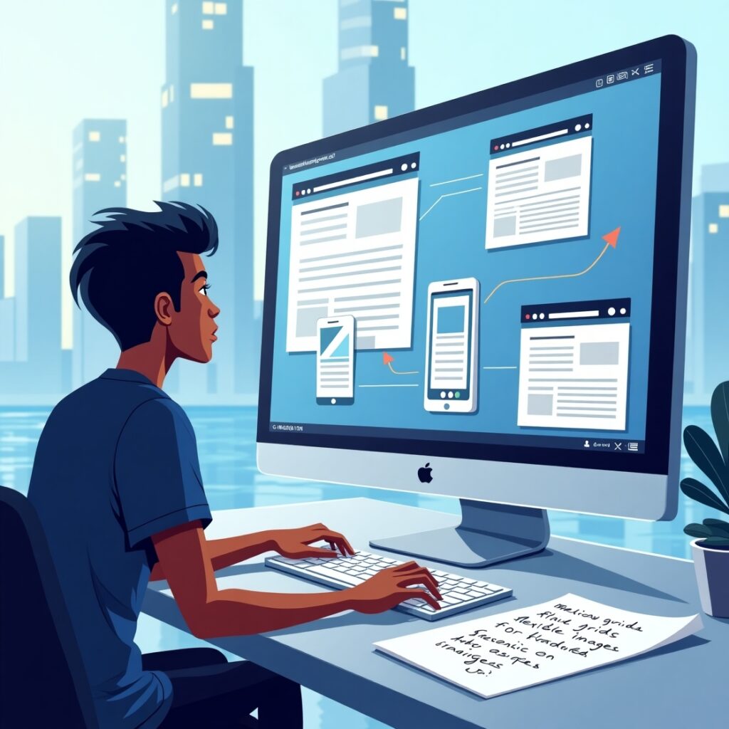
Let’s get foundational: what is responsive design in web development? It’s that slick shape-shifting magic making sites readable on phones, tablets, or your smart fridge. Fluid grids rearrange content, flexible images scale gracefully, and CSS media queries trigger layout changes during viewport resizing. Simple, right?
What is the purpose of responsive web design? Survival. With 60% of web traffic mobile, mobile optimization isn’t optional. Cross-device compatibility keeps users engaged, while SEO for responsive websites makes Google adore you. Website usability hinges on this.
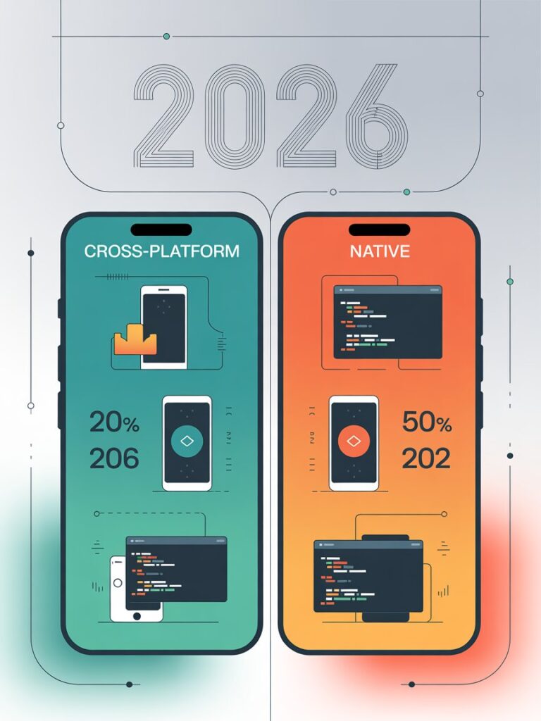
You asked: “what is one advantage of adaptive web design over responsive web design?” Here’s the tea: Adaptive serves pre-cooked layouts for specific devices (e.g., “this is the iPhone 12 template”). Advantage? Potentially faster load times. But responsive is the ultimate improv artist – fluidly adapting to any screen size. For design scalability, responsive wins long-term.
Mobile-first design was phase one. Tomorrow? Your site will sense context. Walking? Driving? Voice-searching? Using dynamic content and sensors, sites will adapt layouts in real-time. User experience (UX) design meets behavioral prediction.
Progressive web apps (PWAs) blend websites and apps – offline access, push notifications, instant loading. For website performance and mobile responsiveness, they’re unavoidable.
Imagine AI adjusting adaptive layouts based on user habits. Bounce rate high? It tweaks flexible images or simplifies navigation. This is user-centered design on steroids.
Accessibility in web design will be baked into frameworks. Voice navigation, dynamic fonts, and HTML5 and CSS3 semantics won’t be “nice-to-haves” – they’ll be as essential as viewport resizing.
Minimalist web design reduces clutter, while performance optimization (think lazy loading, compressed assets) dominates. Why? Because a 1-second delay crashes conversions by 7%.
What will be the future of responsive web design? Sites that don’t just respond – but anticipate. They’ll blend web development technologies, AI-driven dynamic content, and performance optimization to create seamless user experience (UX) design.
The future of web design is here: fluid, intuitive, and invisibly brilliant. Ready to ride the wave?